Monday, 30 April 2018

RADIO ADVERT STEP BY STEP


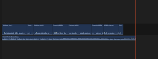
In the making of my radio advert, I listened intently through a mix of makeup adverts and closed my eyes to imagine what I would visualise when hearing the voice overs. When doing this I could picture the imagery that the radio would have so therefore - I used language such as 'kissable colours' or ' sleek finish' and used sounds as lipsticks opening and kissing sounds - this illustrates what my radio is aiming to do and visualise within the audience. It allows there to be a clear aim behind the radio so when listening in the car or on a music system - it is illustrating clearly what it is selling or producing. I included voice overs above my soundtrack that I have previously used in both my Advert 1 and TV sponsorship as I followed this to keep the house style of all my produced work so it appears to relate back to the same product and company that created the product and therefore the repetition of the soundtrack reinforces the remembrance and referral back to my product so more members of the audience are likely to be appealed to the product. To create my radio piece, I had to resize the voice overs so they fit to the temperate of the other voice overs I included meaning I had to enhance the voices using the tools on the side in the second screenshot. I also had to heighten the volume and produce it so the voices were the main focus instead of there being a large focus on the sound track. Each voice over was at at least 10 volume, however the sound effects of the lipstick opening and the kiss at the end I put that to 12 volume so the audience were clearly aware to what they were hearing on the radio to reinforce the makeup imagery more. I let my music soundtrack drag on a bit more towards the end allowing it to fade by itself to make it sound more natural and specific to the audience. I not only used a female voice over but also a male voice over to illuminate that I am going for a gender neutral product. Towards the end the male voice over is to say 'Get Lippy In Style' which is the slogan. 


The use of the male actor within this advert influenced me to appeal to not only my male audience through the addition of a male actor within my adverts but also through the voice of the male actor in my radio - this reinvents the idea that make up is only for females illustrating that through my product it is for any gender. The fact that the male actor starts the advert saying 'make a statement' speaks to the audience more than the actual advert as he takes control within the makeup advert despite his gender reinforcing the gender value of makeup and the developing society that we now evolve within as a community. This advert also helped me get an idea of what to say within my radio advert for example the saying '12 new shades' this influenced me to involve promotions like this. 
Thursday, 26 April 2018

ADVERT 1 STEP BY STEP


This is the screen recording of my first advert - I have changed the backgrounds of each shot from block colours to glitter wallpapers, learning through Youtube I was able to learn how to use and obtain knowledge about using the CGI/Green screen. This was quite difficult and time consuming however I caught on quite quickly. Using the keyer effect over the frame of my recording I was able to remove the green screen behind the actress, then underneath this layer of recording I added the glitter wallpaper right below so it would show behind the actress. I had to learn to scale this image to size so it would not blur and appear distorted in the process. So far I have only been able to record three of my actresses and will soon be able to film my male role, I have chosen to record a male within the clip too as this helps exploit the idea of my product being gender neutral and helps illuminate the idea within the cosmetic industry how the world has evolved and no longer is a female based culture. 

These are both screenshots of that I was explaining above. Highlighted in both screenshots - the sample area is what helps when trying to dissolve areas of the green screen around the actress that hasn't been captured properly - for example in areas around the hair or when they move I have to include sample and drag them around until all the green screen has disappearing and been covered. 


As shown in the screenshots, both have two different angle shots (Close up and Medium Close up) the difference between the two is that one actress shows the mid half of her body including her shoulders and mise en scene of her outfit and the other actress is only showing her face and lips which is important and significant within the imagery of the advert that I am aiming for. I tried capturing the exact colour of the lips for the wallpaper used to keep the house style. 


When creating the first advert - I wasn't very experimental with the shots or the angles I used within the creation however I would like to expand more on techniques and methods of capturing the video/imagery in the second advert that I will create next. Using the lights above and around the camera helped secure me the imagery of this being in front of a light covered mirror just like in most make up adverts as I aimed for the actresses to focus solely on the lens of the camera as if locking eye contact with the target audiences that are watching. In other recordings that I filmed, I shot an extreme close up of my actor/actress hand with them applying the lipstick to their skin (swatching the colour) showing the pigment and then taking the lipstick and covering a piece of plastic in front of the lens so it looks similar to the way other cosmetic adverts do it and cover the camera - most cases they leave a kiss print on the glass and the writing appears across it however I have not yet learned how to do this and it will be quite difficult yet doable to achieve. 

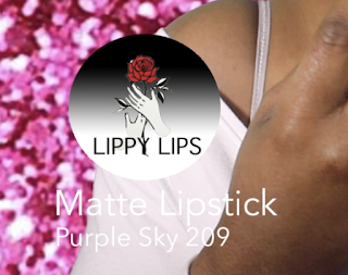
I have edited my own logo on photo shop using a circle then colouring it with a gradient effect using black and white - I then continued to paste the lipstick logo that I created before with the colours of the rose revealing the colour of the lipstick. I also typed out the title of the production across the logo so it is distinctive that this is the logo presenting my product. Below the logo I have labelled what product the actor/actress is using in the recording so it looks like a professional advert as most productions use this technique to appeal to audiences who would want to buy similar colours to that which are used in the advert.


Thursday, 19 April 2018

ADVERT 2 STEP BY STEP


When creating my advert 2, I changed my ideas a lot. This is because I wanted to produce an advert initially totally different from my first - therefore I created this production with an over all black and white theme going on. I also chose to idealise the fact that the boldness of the lipstick allows you to stand out against anything, even the city. To keep the house style of the following advert, I have included the soundtrack that I previously noted that my music producer - Liam - made. 


First shot recorded in Advert 2 - was a close up of the actress moving from facing infront of her to transitioning her face over her shoulder - moving the focus from the actress herself to the boldness of the lippy lipstick. I have used a mirror effect found in the 'effects' tab to apply to the sleekness of the advert shown in many influential adverts I referred to in previous blog posts that have helped me create more than just an idea. 


The second shot noticeable in the advert, is an extreme close up of my lips with included images of the product and the logo to reinforce the cosmetics product brand placement. As I lip-synced 'lippy lips' I placed a voice over of two actresses saying 'Lippy Lips' in sync to include a professional feeling to the placement of the product. In the lower of the screenshot, you can see the different layers. 


Throughout the advert, I used a tool called 'masking' which allowed me to capture certain parts of the recording to change its specific colour. This allowed the lips to be red and the rest to be in black and white.

In this shot, I have included typography over the shot this has an effect to slide across each other this reinforces the sleek, cosmetic advertisement. This feeds into my target audience as it is quite informal in reference to make up and the type of lipstick. The extreme close up of the lips is neat and fixed in consideration to the masking as you have to fix the edges to make it complete to one object. 
  

TV SPONSORSHIP STEP BY STEP


When creating my TV sponsorship, I used a medium close up of my actress mentioned in my group roles post - Faridat - I used this recording as there is clear product placement and it illustrates a make up advert well. As I filmed this recording in front of a green screen I was able to key a background behind it to gain the behind the scenes look - I began screen recording using quick time player over the Background GIF enabling it to be used within the start of my sequence. 


Above is a screenshot of my entire Final Cut Pro screen, showing the put together layers that are on top of my GIF, behind my actress is the GIF in which I have planted. I have included a close up of the GIF Layer to show how I used it within my production. I got this idea by using the GIF through other adverts as normally there is a lot of commotion happening behind the main actress or make up model - either this commotion is hairdressing or makeup being applied within studios. I therefore recorded a scene from a makeup application room to further the idea of my advert reflecting my chosen product to sell and reflecting my chosen target audience. 


After creating the beginning of my sequence, I used a panning movement recording moving closer towards my actress as she moved into the middle of the screen. The panning action faded across a flickering effect I included of my product showing on the screen behind her. This provided me with enough imagery of my product so the audience was aware of what I was aiming to sell. By doing this I am able to mirror the product beside the actress, showing how it applies to the lips. This panning recording of the actress had a fade effect over the layer allowing it to fade to the 'THE VOICE SPONSORED BY LIPPY LIPS' screen in which I created a logo for my brand again seated next to an image of my product of either of its side. I produced the logo and the screenshots of my lipstick on photo shop shown below. 


The following screenshot is of my ending sequence with the logo and the photo shopped edits of my product. Above this layer I have included the text ' The voice sponsored by Lippy Lips' and I have recorded myself saying this and layered it over the top as a voice over. I chose to lay the products either side of the logo as it makes the logo shine with more prominence and more importance referring to my brand. Unfortunately I couldn't get the glitter background behind the products to move and flash but instead I attached it to my product and used it as a margin around the product so it stood out against the blackness of the classic looking screen that had my product placed within the shot. I used the main colours of which I have made important within my advert which is pink and red - to feed into my chosen audiences and make my product appear more endearing to more audiences. Underneath the screenshot of the entire final cut pro I have chosen to display a close up of my voice over which I have enhanced the sound of and increased the volume so it is heard above the sound track. The sound track is also produced originally by the help of my music technician - Liam - he began by cutting up several pieces of loops found on garage band and followed the influence of 'Rimmel Londons' advert so he could follow the codes and conventions of a makeup sounding advert as this would intensify the house style that I was creating within my makeup advert. 


The above are screenshots of my lipstick creation on photo shop of which I edited a glitter background behind my product. It was quite difficult to edit the glitter background to perfection meaning straight and clean cut however I tried several times and put the best versions within my advert. I tried learning how to make them flash and flicker on the screen of which I will show an example of what I tried to recreate - however was unable to so I placed them either side of the logo of my product of which I stated above in the last paragraph. 


This advert created by Dior is that of what influenced me to think of recreating the idea of the lipstick with a glittery background flashing behind the actual product as I thought this was quite sleek and modernised - illustrating the make up industry in society today. The inclusion of this idea would of helped me add that bit of extra professionalism to my advert so it would sell to the audience more than it does now. 


Using Quick Time Player, I am able to screen record my TV Sponsorship - in the recording shown I am adding text into the shot using the 'soft edge' type which moves swiftly across the bottom of the screen, I have increased the sizing of the text to bring across more of the cosmetics advertising imagery and included a thick black borderline around the writing which reads 'Sleek finish' Unfortunately I am unable to record the audio as well as the screen so we are unable to hear the voice over that moves in sync with the typography on the screen - but many techniques allow me to place this in action at the same timing as each other. I learned through Youtube how to combine each effect and how to play them along the house style of makeup.